Labels

Friday, 12 November 2010

My finished contents page


This is my completed contents page.
I have included another three images that are both relevant and appropriate for my target audience and the genre of my magazine. As you can see, I have carried on my colour scheme to show that there will be a recognisable theme running throughout the whole magazine. I thought a note from the headteacher would be a good idea because it would make the students feel a bit more connected with their staff. I used bolder fonts for page numbers because they are vital pieces of information  and it's important that the reader knows how to navigate their way around my magazine. I have also included a 'competition' plug at the bottom because I have learnt from research that student audiences respond well to competitions and the possibility of receiving things for free.


My finished front cover


This is my completed student magazine front cover. I have used the colour scheme of blue, purple, black and white, just as I had planned. I have used blocks of colour to make the magazine seem bright and interesting, but I have made sure that the content of the magazine is always the main focus. I have a clear mid-shot main image and one that connotes intelligence and determination.

Thursday, 11 November 2010

Pre-production mid-shot ideas


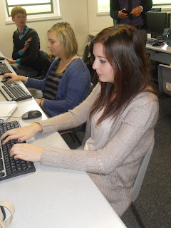
This was one of the images I was considering on using for my front cover. I like the side on angle of the picture, because I think it makes it slightly more exciting, and the fact that the subject is working at a computer shows that my magazine is clearly about school.However, I decided not to use this photo in the end because there are boys in the background, and my magazine is for an all girls school. This picture, therefore, would not be appropriate. 


This photo was also a possibility for my front cover. It's quite similar to the one I have actually used, but I decided not to this picture because it does not contain anything that is obviously to do with school, so I thought it might be hard for my audience to see why this picture was on the front of my cover. 


This is the picture that I will be using for my front cover. It is clearly a mid-shot and I like the relaxed and friendly composure the subject has in the image. I thought it would be appropriate for my school magazine because she is holding a folder and is clearly in school. Her outfit is fashionable but still smart and she looks very respectable, and I'd hope that the readers of my magazine would look to her as someone they would aspire to be like. This image is also the best one for my front cover because I wanted a relatively plain background, so that my bright colours can be layered on top with no problems.

Planning the layout of my magazine


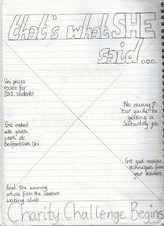
This is a sketch of what I would like my magazine to look like. As I have explained in some of my previous blogs; the masthead will be placed at the top, the headline will be at the bottom, and the plugs will be down both sides. 

I have now also thought of what my headline and plugs will be. 

My headline is 'Charity Challenge Begins' and I think it makes a good headline because it includes alliteration which makes it memorable, and it's a subject that many people feel quite strongly about. 

Down the right hand side of my magazine I have written 'No money? Your guide to getting a Saturday job inside.' I thought this would be appropriate because students are always short of money and are trying to get jobs. Also down the right side is 'Get good revision techniques from your teachers.' which I thought would also be relevant because January exams will soon be coming up, and students want to know the best ways to revise so that they can do well. 

Down the left hand side I have written 'Uni prices rocket for 2012 students' which is very current news and something that all students are concerned about at the minute. The next plug down says 'Get involved with youth work at Bedfordshire Uni' I've abbreviated the word 'university' to 'uni' because I know that younger people appreciate casual language like that. This plug is appropriate because all students are eager to do extra curricular activities that they can add to their UCAS forms. Also down the left side is 'Read the award winning article from the creative writing club' which will hopefully give the reader a sense of pride about their school and fellow students, and encourage them to pick up my magazine. This plug will also interest students that took English A level. 

Wednesday, 10 November 2010

Planning my masthead


These are just some of the ideas i've had for the masthead of my magazine. 


I thought 'ENTER' would be a good masthead because it implies that by opening the magazine, the reader can enter a whole new exciting world. I chose to do it in capitals so that it would mimic a road sign, because that would be appropriate for the age of my audience as they will just be learning to drive.


'info!' was another idea I had for a masthead. I thought 'info!' would be good because it's quite plain in it's meaning, but by shortening the word 'information' I have made it appropriate to sixth formers because youths prefer abbreviations and colloquial language. 


I thought 'happening' was also a good masthead idea because it suggests that my magazine is up to date with current affairs, and a modern concept. It also suggests that my magazine is a hub of excitement and and that interesting things are 'happening' in it. 


Although I haven't drawn it, the masthead I have actually chosen to use is; 'that's what she said...'. After thinking of this idea and adding it to my list of possible mastheads, I asked 6 of my classmates (all female) which one they preferred, and 5 of them chose 'that's what she said...' and told me it was the best because it added some humor to the magazine (it's a common euphemism that teenagers are using at the minute), but also because it makes it very clear that my magazine is for girls. 

Planning my colour scheme

As my student magazine is aimed purely at girls, I have come up with 3 possible colour schemes tha would be appropriate for this audience.


1. Blue Purple Black.
I think these three colours compliment each other very well because the purple can be layered on top of the blue, and the black on top of the purple. There is a mix of dark and light colours which gives it tone, and this means the magazine wouldn't look too dull or too bright.  Blue is a unisex colour so it applies to girls and I have chosen to put purple with it because purple is a slightly more feminine colour. I like this colour scheme because I think it will attract 'tomboys' as well as 'girly girls'. 


2. Orange Red Black.
This bright colour scheme would certainly attract someones eye, and once again, the red and orange go well together. Orange connotes happiness, so this would be a very positive colour scheme to use. However, I think the red and orange together would just be a bit too much, as they're both really bright colours, so I doubt that I'll use this colour scheme. 


3. Pink Peach Black.
As my magazine is aimed at girls I thought I could possibly get away with using some really feminine shades in my colour scheme. I have chosen pink because it's the colour that is associated with girls the most, and I thought that peach would compliment this in a soft, but still girly way. However, I think this colour scheme would be better used on a fashion magazine where there is a niche audience of fashion loving girls. I would rather make my colour scheme applicable to all sorts of different girls, because that's who it will be aimed at.

Planning my front cover layout

1.                                                                                       2.

As you can see from my drawings, I have tried 2 different layouts for the front of my magazine.

Front cover design 1 -
This design is very similar to a typical magazine front cover, and that is why I like it. It's more familiar. The masthead will be situated at the top of the magazine, and will be the biggest and boldest line of writing on the whole magazine, because I want the masthead to be noticeable. Directly below that will be the headline, and that would be the second largest use of text. The mid-shot image will cover a large proportion of the front cover, but not all of it. I have drawn that information's, plugs and adverts will be included down both sides as this is a convention typically used on magazines, and I think it's an effective one.

Front cover design 2 -
I tried to make this front cover more ascetically interesting by putting the main masthead down the right side. Like my other layout, the masthead will be the largest text on my front cover. The headline for this cover will go directly at the top, whereas all the information, plugs and adverts will be at the bottom. The mid-shot will once again be the background for the cover, but will be more predominantly covered down the sides and at the bottom. Admittedly this layout is probably more interesting to look at than the other, but I think I will be more inclined to use a layout similar to the first because it's more recognisable and enhances the more important features of my magazine.

Monday, 8 November 2010

Planning and testing my student magazine

PLANNING

My student magazine is going to be for Aylesbury High School. This is an all girls school which means there is a specific niche audience that my magazine will apply to. Therefore, it is important that my magazine is appropriate for a female audience, and includes aspects that females would appreciate.

TESTING

I asked a group of 10 girls (all very different) what kinds of things they would like to see included in a student magazine, and these are the results I received from them...

  • 6/10 girls said they would like a magazine that included information about the extra curricular activities that they could get involved in at school.

  • 5/10 girls said they would like to know about what all the different houses in school are getting up to, and what charity each house is supporting this year.

  • 8/10 of the girls said they would like information about universities and how to write CVs and personal statements. 

  • 3/10 girls said they would like gossip included in the magazine.

Taking this all into consideration, I think I will make my magazine more informative than entertaining, but I will include 'lighter' aspects to give the magazine a more user-friendly feel. I don't want my readers to feel like they are being lectured by teachers. I want my magazine to be helpful and give advice.
I am also part of the demographic I'm aiming my magazine at, so I think that my opinions are also valid for what I want the magazine to contain, as well as the results I have recieved from others.

Friday, 5 November 2010

My genre, audience and purpose

The genre of my magazine will be hybrid; it will contain a mixture of educational, sporty, and gossip articles. It's main purpose will be to inform the student about the going ons of their sixth form, but to keep the interest levels up I would also like it to have entertainment element to it as well. The audience of my magazine will be sixth formers, so everything I include on and in my magazine will need to be appropriate for people that age. I intend on using the hypodermic syringe theory throughout my magazine because the opinions, stories and issues raised in my magazine should effect people and influence them. However, I want my magazine to make my audience rethink their opinions, but I do not wish for it to force anyone into changing their mind about any issues. I don't want my magazine to be dictating. 

Thursday, 4 November 2010

Researching genre, purpose and audience of student magazines

Genre
Every magazine has a genre, whether it's sport, fashion, gossip or something else. It's important for a magazine to have a genre because then it can be aimed a particular audience, and it gives the magazine a purpose. You can get magazines with 'hybrid genres' which means that it has two or more subjects that it covers, for example 'Look' magazine covers both fashion and gossip, making it a hybrid magazine. 


Purpose
The purpose of the magazine affects what kind of pictures and articles go in it, and what tone the whole magazine takes. Some magazines are purely for entertainment, whereas others are created specifically to inform the reader about something. 


Audience
Every magazine is aimed at a specific group of people whether it's boys, girls, football lovers or fashion fanatics. This means that all magazines have a target audience and will include conventions that will relate the best to that specific group of people. The target audience affects everything about a magazine; what colours are used, what language is used and almost everything else.