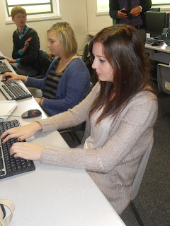
This was one of the images I was considering on using for my front cover. I like the side on angle of the picture, because I think it makes it slightly more exciting, and the fact that the subject is working at a computer shows that my magazine is clearly about school.However, I decided not to use this photo in the end because there are boys in the background, and my magazine is for an all girls school. This picture, therefore, would not be appropriate.
This photo was also a possibility for my front cover. It's quite similar to the one I have actually used, but I decided not to this picture because it does not contain anything that is obviously to do with school, so I thought it might be hard for my audience to see why this picture was on the front of my cover.
This is the picture that I will be using for my front cover. It is clearly a mid-shot and I like the relaxed and friendly composure the subject has in the image. I thought it would be appropriate for my school magazine because she is holding a folder and is clearly in school. Her outfit is fashionable but still smart and she looks very respectable, and I'd hope that the readers of my magazine would look to her as someone they would aspire to be like. This image is also the best one for my front cover because I wanted a relatively plain background, so that my bright colours can be layered on top with no problems.


No comments:
Post a Comment