The use of the colour blue would usually suggest that it's a unisex magazine, but the images of only girls suggests otherwise. This magazine follows the pattern of a colour scheme with three colours: dark blue, light blue and white. The subjects on the front of the cover are both dressed appropriately for a school magazine, and their dress also serves the purpose of showing the difference between public and private schooling. The camera shot used is a long shot, which was probably used so that the whole of the girls could be seen, and consequently, the contrast between them can also be seen clearer. The location that the picture was taken is also appropriate as it's a classroom.
The information on the front of the magazine is actually very limited, which is unusual. However, it may suggest that this particular cover was from a special edition of the magazine, just focusing on 'Public vs Private'. The front cover gives hardly any clues as to what will be included inside the magazine. The bar code tells us that the magazine is not free, and is probably sold outside of a particular school or establishment.
Overall I like the layout, colours, and pictures used on this front cover, but I think it could be improved by slightly more information on the front.

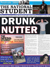
At first glance, it would appear that this magazine looks more like a newspaper than a magazine. However, this is actually a nationally recognised student magazine. It follows many newspaper conventions, like the black and white masthead and headline, and also the article beginning on the front cover. This is unusual for a magazine, and it's something that I wouldn't like to do for my magazine cover. This front cover also doesn't have a main image, but many small inset images.
This front cover does include more plugs, adverts and information about student related topics though, and I do like that about the cover. It lets the reader know some of the things that they will be reading about inside the magazine.
Another not so impressive aspect is that there is not a clear colour scheme. It uses a mix of black and white, blue, red, and yellow, and it's just a little bit too overwhelming.
Overall, I don't really rate this at all as a student magazine cover, and it doesn't include enough of the typical magazine cover conventions, and in some ways, it's just too busy.
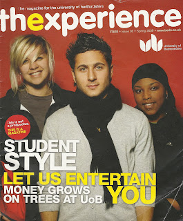
This is the student magazine for the University of Bedfordshire. It has a very clear layout, with a yellow, red and white colour scheme (suggesting it is a magazine for both males and females). It uses a mid shot of three students for it's main image - one boy and two girls - once again suggesting the magazine has an audience of both males and females. The subjects on the cover are also from different ethnic races which shows that there are a variety of multi-cultural people that attend. They are casually dressed to show the kinds of things that they would wear for everyday life at university. There isn't a great deal of information on the front of the magazine, but the information used is very relevant to it's student audience. It talks about money, jobs and entertainment which are all things that matter to university students. The play on words 'let us entertain you' also relates to a student audience because it's a well known line from a song that they would recognise. The inclusion of the website is also purposeful as students are the biggest internet users, but also because it throws the magazine into the 21st century. It also has the University of Bedforshire logo on it which gives clarification as to who the magazine is representing.
Overall, I think this is a very effective front cover. Every convention used shows it's audience and purpose and I think my magazine front cover will most likely be based upon this one, rather than any of the others.
.jpg)

No comments:
Post a Comment